
A Semantic Map of the DANDI Archive
The DANDI Archive now holds more than six hundred public Dandisets, and the number grows every month. Finding the ones relevant to a particular question is harder than the size of the archive suggests. Text search works well when you already know the vocabulary a depositor used, and poorly when you do not: a search for “sharp wave ripples” will not surface a dataset whose abstract says “hippocampal replay during quiet wakefulness,” even though a person reading both would immediately group them together. Search also answers a narrow question. It tells you whether something matching your terms exists, but it does not tell you what else is nearby, which labs are working on adjacent problems, or where the archive is dense and where it is thin.
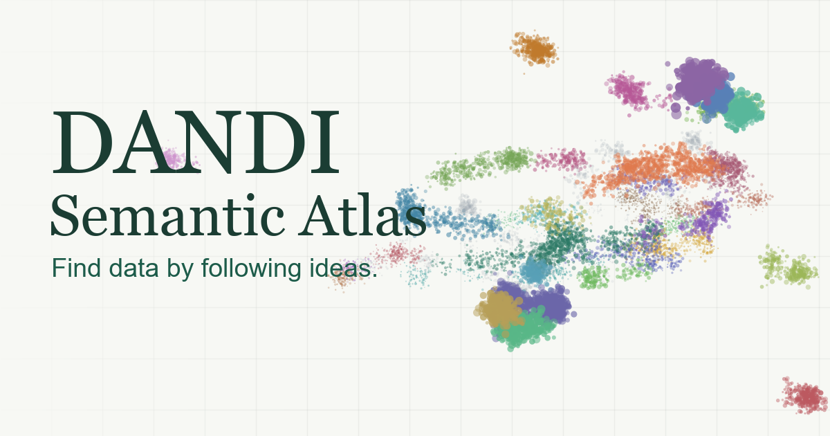
We built the DANDI Semantic Atlas to support the other way of finding things, which is browsing a map. Every Dandiset is a point, positioned by what its metadata means rather than by which words it contains, so datasets describing similar science land near one another whether or not they share vocabulary. The source is on GitHub, and the map rebuilds itself from the DANDI API every night.
What the Map Shows
The current map contains 613 Dandisets, which is every public Dandiset with at least one file in it. Position comes from the dataset’s title, description, keywords, anatomy, species, experimental approaches, measurement techniques, and measured variables, all read directly from the archive’s own metadata records. Dragging rotates the cloud, since the layout is three-dimensional and a fixed projection hides structure that a small rotation reveals. Clicking a point opens its abstract, author list, file count, total size, subject count, and a link straight to the Dandiset on DANDI.
Points can be colored two ways. The default colors them by topic region, which is a grouping the pipeline discovers rather than one anybody assigned. The alternative colors them by primary species, which is useful for a different question: seeing at a glance where the mouse work sits relative to the human intracranial recordings, or how isolated the invertebrate datasets are. Either way, the legend entries are toggles, so the map can be narrowed to a few regions or a few species at a time, and the search box filters the visible points by text on top of that.
How It Is Built
The pipeline is a single Python script, scripts/build_dataset.py. It pages through the DANDI REST API for the dataset list, then fetches each Dandiset’s version metadata. For each record it assembles one natural-language document: the title and description first, followed by short labeled clauses for anatomy, species, approaches, techniques, keywords, and measured variables. The title and abstract carry most of the positional signal, and the trailing metadata sharpens the topic labels described below.
Those documents are embedded with Qwen3-Embedding-0.6B. The embeddings are projected with UMAP into three dimensions, clustered with HDBSCAN, and labeled with c-TF-IDF, which is the BERTopic recipe. The minimum cluster size scales with the archive, at max(6, n // 85), so the number of regions stays roughly stable as DANDI grows instead of fragmenting into dozens of near-duplicate specks.
One Projection for Both Layout and Clustering
The one place where we deviate from the standard recipe is worth explaining, because it is the difference between a map that reads correctly and one that looks broken.
A typical BERTopic setup reduces the embeddings to five or ten dimensions for clustering, since HDBSCAN behaves better there, and then runs a separate two-dimensional reduction for visualization. Those two projections are different functions of the same data, and they disagree. The result is a plot in which two points sitting on top of each other carry different cluster colors, and a region of one color has a few stray points of another scattered through it. Statistically this is defensible. As an interface it is not, because the first thing a user does with a colored scatter plot is trust that position and color describe the same thing.
The atlas runs one three-dimensional UMAP and uses it for both jobs. Clustering operates on exactly the coordinates that get drawn, so a point’s color can never contradict its position. Three dimensions is a compromise: it gives HDBSCAN more room to separate groups than two would, while staying low enough to draw directly. Rotation then does the work that the third dimension requires, which is why the map is draggable rather than static.
What the Topics Look Like
The largest regions in the current build are recognizable at a glance: hippocampus and CA1 (71 datasets), calcium and two-photon imaging (39), extracellular electrophysiology including the Neuropixels surveys (39), motor cortex and anterior lateral motor area (21), human Patch-seq (21), spinal cord (20), peripheral imaging (19), electric fish (17), macaque (17), Drosophila (15), transcranial focused ultrasound (15), and human intracranial working memory recordings (14). None of these categories were specified in advance. They fall out of the language depositors used.
Two results are worth reporting honestly. The first is that 51 datasets, about eight percent, are marked unclustered. HDBSCAN reports outliers rather than forcing every point into a group, and we prefer that. A dataset flagged as an outlier is not badly described. Checking the descriptions, the unclustered datasets have slightly longer abstracts than average. They are simply the ones without enough near-neighbors in the archive to form a region.
The second is that the archive’s own housekeeping shows up as geography. Test uploads, tutorial datasets, simulated data, and format benchmarks sit together in a region of 15 datasets. The clustering is not wrong about this. Those datasets genuinely do describe the same thing, which is infrastructure rather than neuroscience.
The Map as a Metadata Diagnostic
Because the layout is derived entirely from deposited metadata, the places where the map behaves oddly are usually places where the metadata is inconsistent, and this turns out to be one of the more useful things it does.
The clearest example is in the species coloring. The archive contains 224 datasets whose primary species is recorded as “Mus musculus - House mouse” and another 29 recorded as “House mouse,” which are the same animal written two ways, so they occupy two separate legend entries and two separate colors. Another 80 datasets record no species at all. None of this is visible when you read Dandisets one at a time; it is obvious the moment you color six hundred of them by the same field. Similarly, a few topic labels name a submitter or an upload convention rather than a scientific topic, which tells you that for those datasets the free-text description is carrying less information than the c-TF-IDF vectorizer would like. Standardized, complete metadata is the thing that makes an archive searchable at scale, and a map like this one makes the gaps legible.
What It Is Not
The atlas is an exploratory aid. It is a CatalystNeuro prototype rather than an official DANDI Archive feature, and it is not a taxonomy, a ranking, or a substitute for reading the datasets.
Its specific limitations follow from the method. UMAP preserves local neighborhoods much better than global geometry, so “these two points are adjacent” is meaningful while “these two clusters are on opposite sides of the map” is mostly an artifact of the layout. Cluster labels come from term statistics, not from a model that understands the field, so they are serviceable signposts and occasionally awkward ones. And a dataset with a two-sentence description will be placed on the strength of those two sentences, which is a fair reflection of what a reader searching the archive would have to work with.
Running It Yourself
The site is entirely static. All 613 records ship as one 732 KB JSON file and render to a canvas in the browser, so there is no server, no query API, and nothing to keep running. A GitHub Actions workflow rebuilds the map from the DANDI API every night at 05:17 UTC, commits the refreshed JSON only when it actually changed, and redeploys the page.
Locally, npm install && npm run dev serves the app against the committed data, and rebuilding the data takes pip install -r requirements.txt followed by python scripts/build_dataset.py. Passing --limit 150 fetches a subset for a faster preview while you are working on the pipeline.
The map is at catalystneuro.github.io/dandi-semantic-atlas. If you find a region that is mislabeled, a dataset that landed somewhere surprising, or a view of the archive you wish it supported, please open an issue on the repository.